

Internship-Overview
Internship-Overview 2026
A hands-on web design internship focused on website analysis, UI/UX improvements, branding, and client collaboration. The role involved researching user needs, developing design solutions, and contributing to the creation of effective, user-centered websites.
2026

A hands-on web design internship focused on website analysis, UI/UX improvements, branding, and client collaboration. The role involved researching user needs, developing design solutions, and contributing to the creation of effective, user-centered websites.
A hands-on web design internship focused on website analysis, UI/UX improvements, branding, and client collaboration. The role involved researching user needs, developing design solutions, and contributing to the creation of effective, user-centered websites.
Ideation
Completed over the course of the 8 week internship while collaborating with the client on multiple website projects.
My role:
Lead Website Designer responsible for analyzing existing websites and creating user-centered design improvements.
Problem statement
The existing websites lacked clear organization, visual consistency, and user-friendly navigation, making it difficult for visitors to find information.
Goal Statement
Redesign the websites to improve usability, strengthen branding, and create a more engaging user experience.
Goal Statement
Redesign the websites to improve usability, strengthen branding, and create a more engaging user experience.
My role:
6-week concept research
UX Research, UI Design, Branding, Prototyping
Completed over the course of the 8 week internship while collaborating with the client on multiple website projects.
Goal Statement
Redesign the websites to improve usability, strengthen branding, and create a more engaging user experience.
Completed over the course of the 8 week internship while collaborating with the client on multiple website projects.
My role:
Lead Website Designer responsible for analyzing existing websites and creating user-centered design improvements.
Problem statement
The existing websites lacked clear organization, visual consistency, and user-friendly navigation, making it difficult for visitors to find information.
Goal Statement
Redesign the websites to improve usability, strengthen branding, and create a more engaging user experience.
My role:
6-week concept research
UX Research, UI Design, Branding, Prototyping
Completed over the course of the 8 week internship while collaborating with the client on multiple website projects.
Goal Statement
Redesign the websites to improve usability, strengthen branding, and create a more engaging user experience.
Analysis
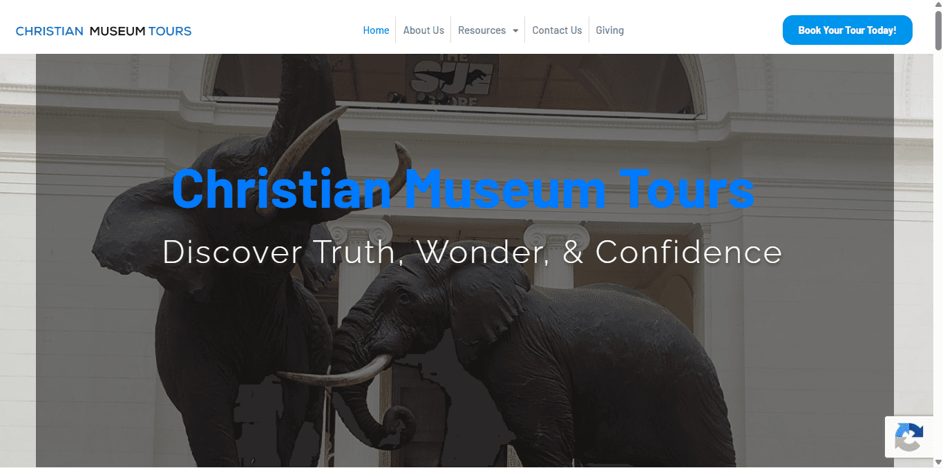
Analysis Website 1:

Constrast
Landing page needs more contrast with the image.
Font needed to match other sites
Heading font color switch with subheading

Footer
Too much negitive space
Needs better use of space
Copyright footnotes need smaller point size
Too much negitive space

Too much negitive space

Too much negitive space

Too much negitive space

Too much negitive space
Analysis Website 1:
Footer Design
Too much negative space
Contrast
Landing page needs more contrast with the image.
Layout Design
Hero Sections
Landing page needs more contrast with the image.
Typography Hierarchy
Website Analysis 1:
Website Analysis 1:
Landing page needs more contrast with the image.
Landing page needs more contrast with the image.
Contrast
Too much negitive space
Footer
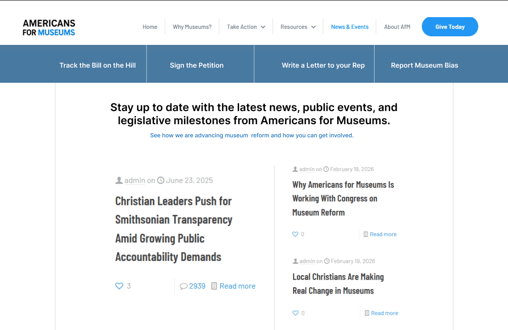
Website Analysis 2:
Website Analysis 2:
Landing page needs more contrast with the image.
Landing page needs more contrast with the image.
Hero Pages
Too much negitive space
Layout Design (mobile version)
Website Analysis 3:
Website Analysis 2:
Font Consistency
Typography Hierarchy
Responsiveness
Analysis Website 2:
Analysis Website 3:
Responsiveness
Analysis Website 2:
Hero Page
Landing page needs more contrast with the image.
Font needed to match other sites
"About" page typically is the last or second to last option on menu (optional)
Mobile Layout
Responsiveness across all sites
Menu drop down needs to be at a different angle
Analysis Website 3:
Hero Page
Landing page needs more contrast with the image.
Font needed to match other sites
"About" page typically is the last or second to last option on menu (optional)
Responsive
Responsiveness across all sites
Menu drop down needs to be at a different angle
Too much negative space
Analysis Website 1:
Constrast
Landing page needs more contrast with the image.
Font needed to match other sites
Heading font color switch with subheading
Footer
Too much negitive space
Needs better use of space
Copyright footnotes need smaller point size
Too much negitive space
Too much negitive space
Too much negitive space
Too much negitive space
Too much negitive space
Analysis Website 1:
Footer Design
Too much negative space
Contrast
Landing page needs more contrast with the image.
Layout Design
Hero Sections
Landing page needs more contrast with the image.
Typography Hierarchy
Website Analysis 1:
Website Analysis 1:
Landing page needs more contrast with the image.
Landing page needs more contrast with the image.
Contrast
Too much negitive space
Footer
Website Analysis 2:
Website Analysis 2:
Landing page needs more contrast with the image.
Landing page needs more contrast with the image.
Hero Pages
Too much negitive space
Layout Design (mobile version)
Website Analysis 3:
Website Analysis 2:
Font Consistency
Typography Hierarchy
Responsiveness
Analysis Website 2:
Analysis Website 3:
Responsiveness
Analysis Website 2:
Hero Page
Landing page needs more contrast with the image.
Font needed to match other sites
"About" page typically is the last or second to last option on menu (optional)
Mobile Layout
Responsiveness across all sites
Menu drop down needs to be at a different angle
Analysis Website 3:
Hero Page
Landing page needs more contrast with the image.
Font needed to match other sites
"About" page typically is the last or second to last option on menu (optional)
Responsive
Responsiveness across all sites
Menu drop down needs to be at a different angle
Too much negative space
User Personas
Analysis
Visual Identity
Typography-Logo:
Color scheme:
Playfair
AaBbCcDdEeFfGgHhIi
Unbounded
AaBbCcDdEeFfGgHhIi
Typography-App:
227BB8
341917
60BEFF
Typography-Logo:
Color scheme:
Playfair
AaBbCcDdEeFfGgHhIi
Unbounded
AaBbCcDdEeFfGgHhIi
Typography-App:
227BB8
341917
60BEFF
Typography-Logo:
Playfair
AaBbCcDdEeFfGgHhIi
Unbounded
AaBbCcDdEeFfGgHhIi
Typography-App:
Color scheme:
227BB8
341917
60BEFF
Typography-Logo:
Color scheme:
Playfair
AaBbCcDdEeFfGgHhIi
Unbounded
AaBbCcDdEeFfGgHhIi
Typography-App:
227BB8
341917
60BEFF
Typography-Logo:
Color scheme:
Playfair
AaBbCcDdEeFfGgHhIi
Unbounded
AaBbCcDdEeFfGgHhIi
Typography-App:
227BB8
341917
60BEFF
Typography-Logo:
Playfair
AaBbCcDdEeFfGgHhIi
Unbounded
AaBbCcDdEeFfGgHhIi
Typography-App:
Color scheme:
227BB8
341917
60BEFF
Prototyping
Prototype:
Final


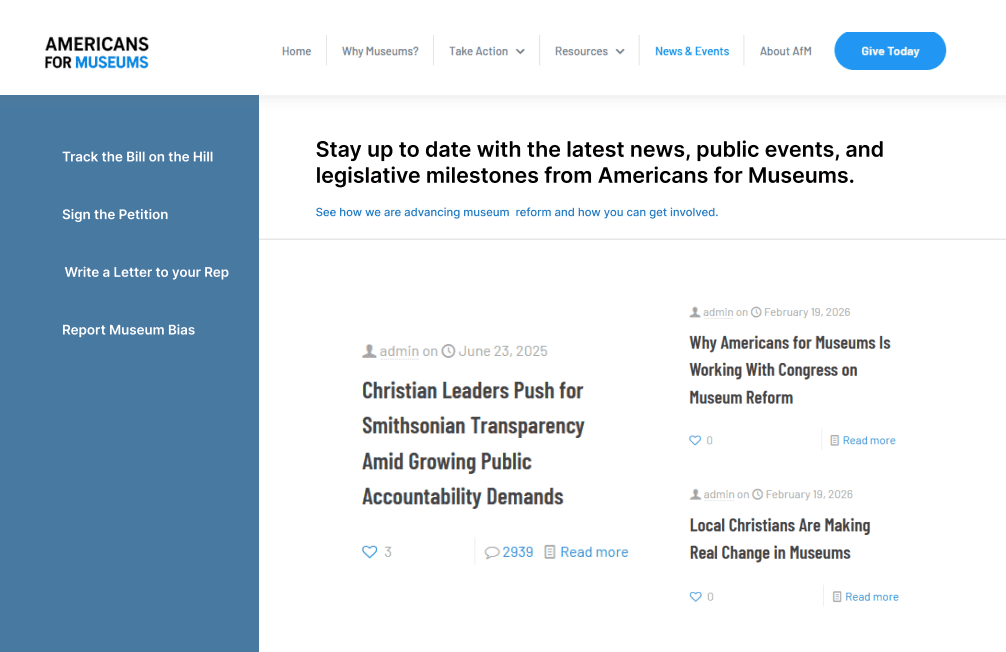
Prototype Options:
Final:
Prototype:
Prototype:
By testing these interactions early, I was able to identify pain points, refine the experience, and determine which features deserved the most attention moving forward.
Prototype Options:
Back To Top
>




Before:
By testing these interactions early, I was able to identify pain points, refine the experience, and determine which features deserved the most attention moving forward.
Prototype Options:

