
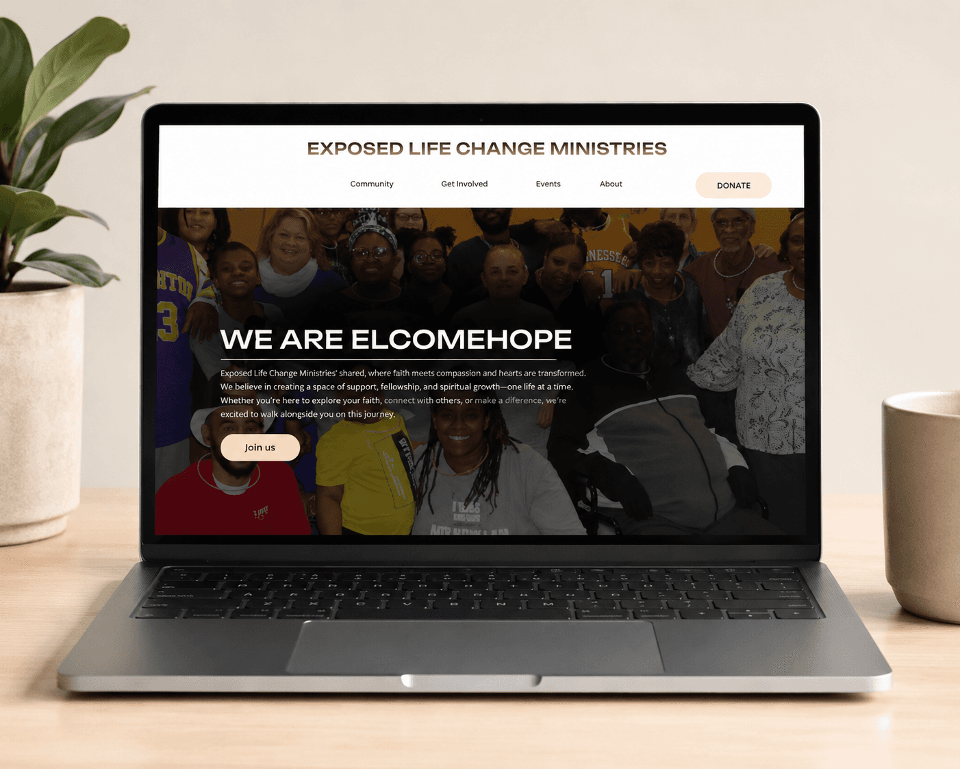
ElcomeHope-Overview
The goal of this redesign was to transform WelcomeHope's website into a more intuitive and engaging experience. Through research, analysis, and user-centered design principles, the project addressed navigation challenges and information overload while creating a clearer path for users seeking resources, support, or opportunities to contribute to the organization's mission.

2024

The goal of this redesign was to transform WelcomeHope's website into a more intuitive and engaging experience. Through research, analysis, and user-centered design principles, the project addressed navigation challenges and information overload while creating a clearer path for users seeking resources, support, or opportunities to contribute to the organization's mission.
The goal of this redesign was to transform WelcomeHope's website into a more intuitive and engaging experience. Through research, analysis, and user-centered design principles, the project addressed navigation challenges and information overload while creating a clearer path for users seeking resources, support, or opportunities to contribute to the organization's mission.
Wellbody-Overview 2023
The goal of this redesign was to transform WelcomeHope's website into a more intuitive and engaging experience. Through research, analysis, and user-centered design principles, the project addressed navigation challenges and information overload while creating a clearer path for users seeking resources, support, or opportunities to contribute to the organization's mission.
2024
The goal of this redesign was to transform WelcomeHope's website into a more intuitive and engaging experience. Through research, analysis, and user-centered design principles, the project addressed navigation challenges and information overload while creating a clearer path for users seeking resources, support, or opportunities to contribute to the organization's mission.
The goal of this redesign was to transform WelcomeHope's website into a more intuitive and engaging experience. Through research, analysis, and user-centered design principles, the project addressed navigation challenges and information overload while creating a clearer path for users seeking resources, support, or opportunities to contribute to the organization's mission.
Ideation
WelcomeHope's website redesign was created to improve usability, accessibility, and engagement. By simplifying navigation and strengthening the user experience, the redesign helps visitors quickly find resources, connect with the organization's mission, and take meaningful action.
My role:
Research, UX Analysis, Information Architecture, Wireframing, UI Design, and Website Redesign.
Problem statement
The goal of this redesign was to transform WelcomeHope's website into a more intuitive and engaging experience.
Goal Statement
Redesign the website to create a more intuitive, accessible, and engaging user experience that clearly communicates WelcomeHope's mission while helping users easily access resources and take meaningful action.
Goal Statement
Redesign the website to create a more intuitive, accessible, and engaging user experience that clearly communicates WelcomeHope's mission while helping users easily access resources and take
meaningful action.
My role:
6-week concept research
UX Research, UI Design, Branding, Prototyping
WelcomeHope's website redesign was created to improve usability, accessibility, and engagement. By simplifying navigation and strengthening the user experience, the redesign helps visitors quickly find resources, connect with the organization's mission.
Goal Statement
Redesign the website to create a more intuitive, accessible, and engaging user experience that clearly communicates WelcomeHope's mission.
WelcomeHope's website redesign was created to improve usability, accessibility, and engagement. By simplifying navigation and strengthening the user experience, the redesign helps visitors quickly find resources, connect with the organization's mission, and take meaningful action.
My role:
Research, UX Analysis, Information Architecture, Wireframing, UI Design, and Website Redesign.
Problem statement
The goal of this redesign was to transform WelcomeHope's website into a more intuitive and engaging experience.
Goal Statement
Redesign the website to create a more intuitive, accessible, and engaging user experience that clearly communicates WelcomeHope's mission while helping users easily access resources and take meaningful action.
My role:
6-week concept research
UX Research, UI Design, Branding, Prototyping
WelcomeHope's website redesign was created to improve usability, accessibility, and engagement. By simplifying navigation and strengthening the user experience, the redesign helps visitors quickly find resources, connect with the organization's mission.
Goal Statement
Redesign the website to create a more intuitive, accessible, and engaging user experience that clearly communicates WelcomeHope's mission.
Analysis

Stronger hierarchy guides users' attention to key content and calls to action.
Spacing/Margins
Sizing (hierarchy)
Layout Design
Email signup
Well-structured content makes information easier to scan, understand, and access.
Client request, email pop up.
Consistent spacing improves readability, creates visual balance, and helps users navigate content more comfortably.
Typograpghy
Builds consistancy throught the website and readabilty across platforms
Analysis
Website Analysis
Stronger hierarchy guides users' attention to key content and calls to action.
Spacing/Margins
Sizing (hierarchy)
Layout Design
Email signup
Well-structured content makes information easier to scan, understand, and access.
Client request: email pop up.
Consistent spacing improves readability, creates visual balance, and helps users navigate content more comfortably.
Typograpghy
Builds consistancy throught the website and readabilty across platforms
Stronger hierarchy guides users' attention to key content and calls to action.
Spacing/Margins
Sizing (hierarchy)
Layout Design
Email signup
Well-structured content makes information easier to scan, understand, and access.
Client request, email pop up.
Consistent spacing improves readability, creates visual balance, and helps users navigate content more comfortably.
Typograpghy
Builds consistancy throught the website and readabilty across platforms
Analysis
Stronger hierarchy guides users' attention to key content and calls to action.
Spacing/Margins
Sizing (hierarchy)
Layout Design
Email signup
Well-structured content makes information easier to scan, understand, and access.
Client request: email pop up.
Consistent spacing improves readability, creates visual balance, and helps users navigate content more comfortably.
Typograpghy
Builds consistancy throught the website and readabilty across platforms
User Personas
Visual Identity
FBD1BB
341917
FEEEE2

Typography-Logo:
Unbounded
Typography-App:
Playfair
Color scheme:
Typography-Logo:
Poppins
AaBbCcDdEeFfGgHhIi
Potta One
AaBbCcDdEeFfGgHhIi
Typography-App:
FBD1BB
341917
FEEEE2
Typography-Logo:
Unbounded
Typography-App:
Playfair
Color scheme:
FBD1BB
341917
FEEEE2
FBD1BB
341917
FEEEE2
Typography-Logo:
Unbounded
Typography-App:
Playfair
Color scheme:
Typography-Logo:
Poppins
AaBbCcDdEeFfGgHhIi
Potta One
AaBbCcDdEeFfGgHhIi
Typography-App:
FBD1BB
341917
FEEEE2
Typography-Logo:
Unbounded
Typography-App:
Playfair
Color scheme:
FBD1BB
341917
FEEEE2
Prototyping
Prototype:
Final
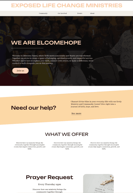

Final:
Prototype:
Before:
After:
Before:
After:
Back To Top
>





Before:
After: